
5 Best Online Donation Pages for Inspiration
Evolving technology has a direct effect on the church, and the trend away from offering plates and towards online donation pages illustrates this fact perfectly. People are doing more in the digital world than ever before, and this turns out to be a blessing during a time of social distancing and lowered attendance.
For your ministry’s donation page to be effective, though, there are certain rules you should abide by. And since many feel that the best way to learn is by example, the following collection of brands succeeding with online donation pages should help you create the perfect page for your ministry.
1. Lakeside Hope House
As a nonprofit that works to fight inequality, poverty and food insecurity while improving communities, Lakeside Hope House has has got a pretty full plate. Much of the assistance they provide is made possible through donations, and their visually appealing online donation page helps ensure those contributions keep coming in.
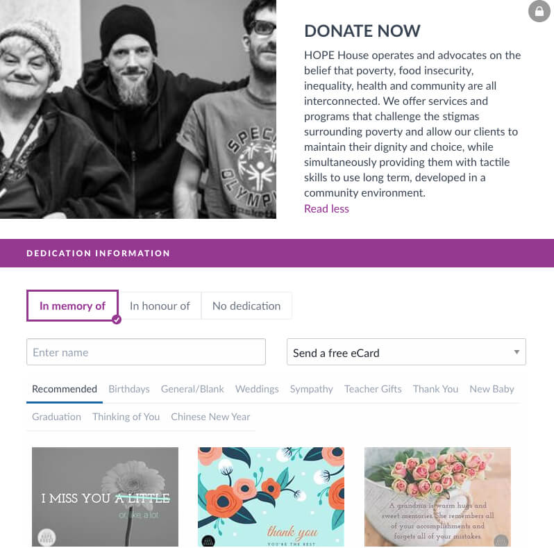
If you look at the homepage of the site, you’ll notice that their branding – all the way down to color choice – remains consistent. This alone can increase revenue by up to 23 percent. The organization’s goal is also clearly stated, so donors know exactly what their contribution is going towards.
A particularly standout aspect of this page is the ability to donate in honor or remembrance of another individual. This could turn individuals who otherwise may have not contributed into first-time donors.
2. Mozilla
In many instances, simplicity is the key to success. The online donation page of Mozilla lives by this rule. Their mission statement is prominently displayed, and they include an image to add some visual appeal to the form. Everything else about the page is straightforward. They even pre-select a donation amount to make the decision easier on donors.
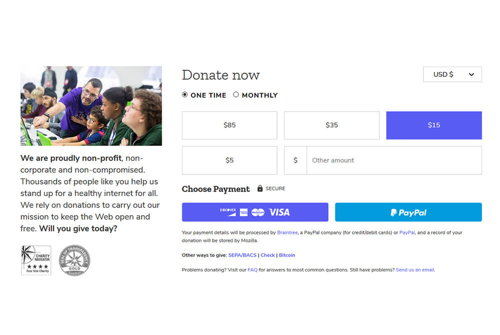
The simplicity continues throughout the entirety of the form, and it all takes place “above the fold” on the page. This is a great design tip to increase donor engagement since users do not have to scroll through the page to contribute. You can also see that multiple payment options are available, so just about anyone can give digitally through this portal.
Offering a variety of payment methods can help you better target specific subsets of donors. Contact us at DonorWerx today to learn more about properly segmenting your contributors in order to increase giving.
3. CAMFED
Through increasing education and helping empower girls in Africa, CAMFED strives to end poverty on the continent. There are several standout elements featured on their online donation page, but the video player is what makes the organization’s donor form stand out on this list. It provides an in-depth look at exactly where donors’ money is going.
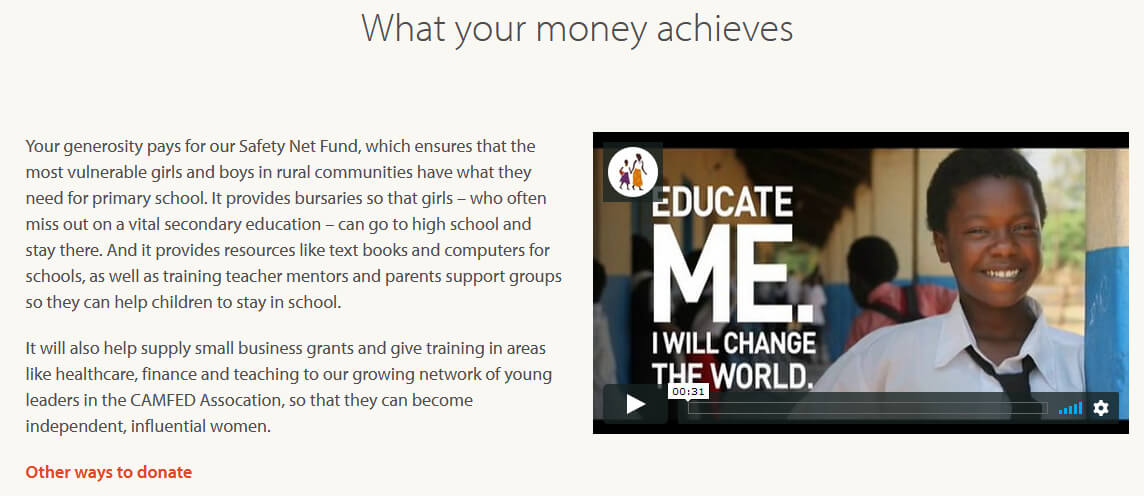
Above the fold on the page, you’ll find images along with information on what different donation levels accomplish. They explain exactly what you need to donate to provide school supplies, uniforms, or a high school education for girls in the program. This is one of the most effective ways to tell contributors exactly how their support is changing lives.
4. Good Sheperd Centres
Creating a donor thank you video is one of the biggest lessons church leaders should learn, but this isn’t the only time a “thank you” is appropriate. People expect a show of gratitude the moment they contribute, but Good Sheperd Centres goes one step further with a graphic that says “Thank you” directly on the online donation page. They’re appreciative even before a contribution occurs.
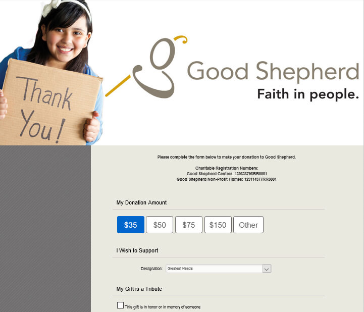
If you scroll down a bit – under the pre-selected donation amount – you’ll see a drop-down menu where donors can choose how they support the cause. Parishioners at your church are more likely to donate if they can give to specific ministries and projects. Even if there’s not much diversity in your budget, you can create categories based on typical expenses.
If you go this route, make sure to include a general purpose fund for those who want to make a general donation. Give this option a name that sounds urgent – much like Good Sheperd Centres did with “Greatest Needs.”
5. Innocence Project
The Innocence Project sticks to simplicity with their online donation page. Visitors are greeted with a short message conveying how their contribution helps, an image featuring people who have benefited from the organization, and a few options on how much to give. They also include an easy-to-notice link for frequently asked questions.
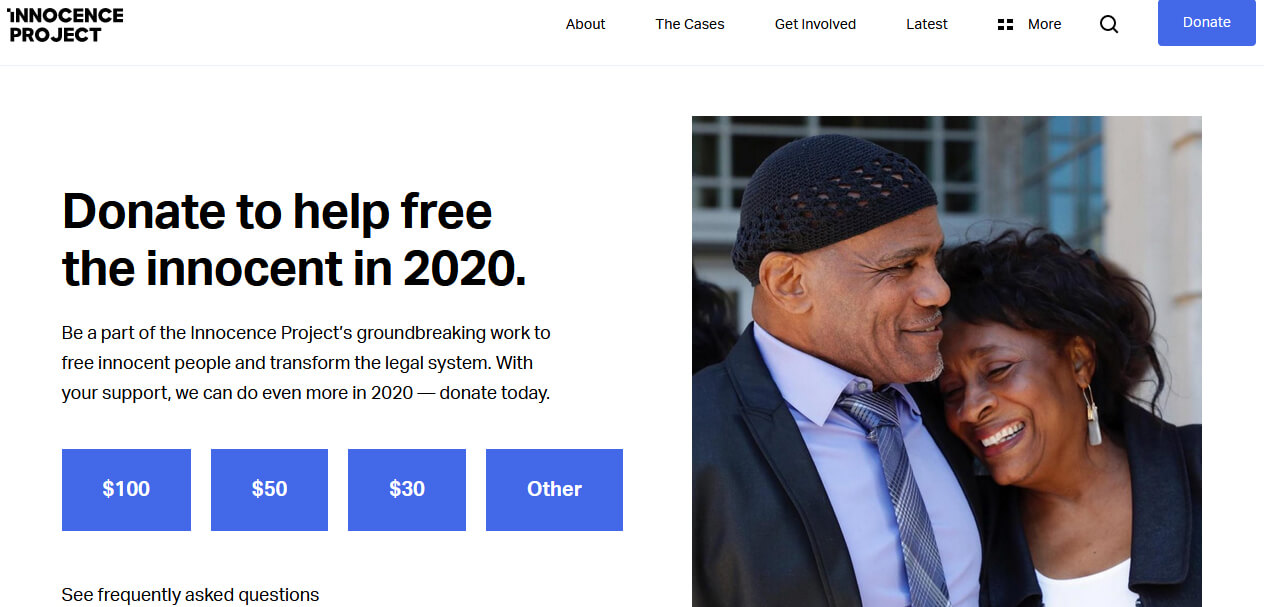
Perhaps the biggest standout for this page, though, isn’t readily apparent until you select a donation amount. Once you do this, a form pops up which includes the option to turn on automatic payments. This increases donation dollars and encourages continued giving.
At a time when church pews are empty due to social distancing, giving congregants a no-hassle option for becoming recurring donors is essential. Through the SecureGive digital giving software, DonorWerx provides this option for your ministry.
You Can Have the Next Best Online Donation Page
These donation pages are great examples of best practices. You should never fall into the trap, though, of thinking they’re somehow the pinnacle of perfection. You shouldn’t strive to be like these examples – you should strive to be better. By utilizing strategies from each of these online donation pages, you can take your ministry’s fundraising to the next level.
If you need help creating a donation page that engages your congregation, contact us today at DonorWerx to get the ball rolling on increasing church revenue to better serve the Lord.


